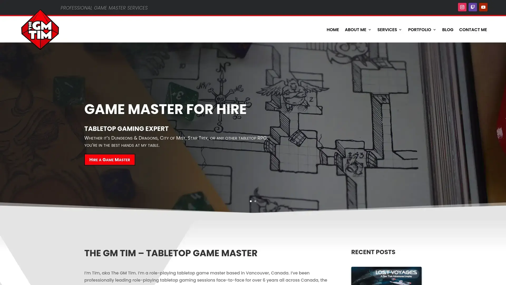
Redesigning and rebuilding TheGMTim’s website
TheGMTim is a role-playing tabletop game master based in Vancouver, Canada. He’s been professionally leading role-playing tabletop gaming sessions face-to-face for over 6 years all across Canada, the United Kingdom and Europe.
A couple of years ago, I reached out to him as a fellow tabletop gamer because I noticed a few security issues with his personal blog. I offered him some free advice on how to fix the problems and even did some hands-on work to help secure everything for him. Since then we’ve been good friends and, in mid-2022, he gave me the go-ahead to do a full re-build and re-design on his website.
Goals & Features
My overall goal was to reinvent this website and give it a sense of brand and identity:
- Create a brand-new logo
- Engaging content such as images
- A thought-out layout creates a user journey
- Showcase the latest blog posts
- Showcase TheGMTim’s services as a GM for hire
- Help new users with an informative FAQ section
- Utilise call to action effectively
Tech Stack
- PHP ^8.0
- WordPress ^6.0
- Theme: Divi by Elegant Themes ^4.22
- Plugins (Not exhaustive):
Demonstration
As you can see in the above video, the original blog was very basic. It had a dark theme and featured a list of recent blogs with no engaging content like featured images. Additionally, the website lacked any real brand or identity, feeling quite forgettable.
In the new version of the website, everything is very eye-catching without overwhelming users. There is a strong sense of brand to the design and the typography, everything is clear and spaced evenly, and the functionality is much stronger.
Users are still shown the latest blog posts, but now they feature images to help draw more attention. Additionally, the landing page promotes and encourages users to explore the site by offering opportunities to go to other pages such as the ‘About Me’ page, and the ‘Contact Me’ page.
By utilising backgrounds and drop-shadows, the website has a strong sense of depth. There is a clear foreground and background which makes the website feel full and well thought out.
Diving deeper
This website has had a few knock-on effects for Tim. He’s seen an increase in organic traffic as a result of the on-page SEO I’ve conducted, he’s seen an increase in enquiries submitted via the website’s contact form due to the call to action encouraging users to do so, and he’s had a wealth of compliments from his friends and clients who have viewed the new website.
Once the rebuild and design were done, I handed the keys back to Tim. While I continue to offer ongoing support for any questions or problems he has, he now maintains the website independently thanks to some coaching and tuition from myself.
I’m glad Tim gave me the trust to carry out this work, as seeing the results it provided for him was very fulfilling. Websites are the shopfronts of the modern world, so anybody wanting to pursue their passions should give their websites the attention they deserve. Websites are your chance to give a strong first impression, and I’m glad Tim’s website now does justice to the great service he provides as a professional game master.

